6 Color Palettes to Inspire Your Life
Sometimes you just need to add a little more color in your life. These bold color palettes, inspired by travel around the world, are here to do just that. Whether you’re looking for something a little more inspired for your home or a unique color palette for your wedding, we’ve got you covered. Which one is your favorite?
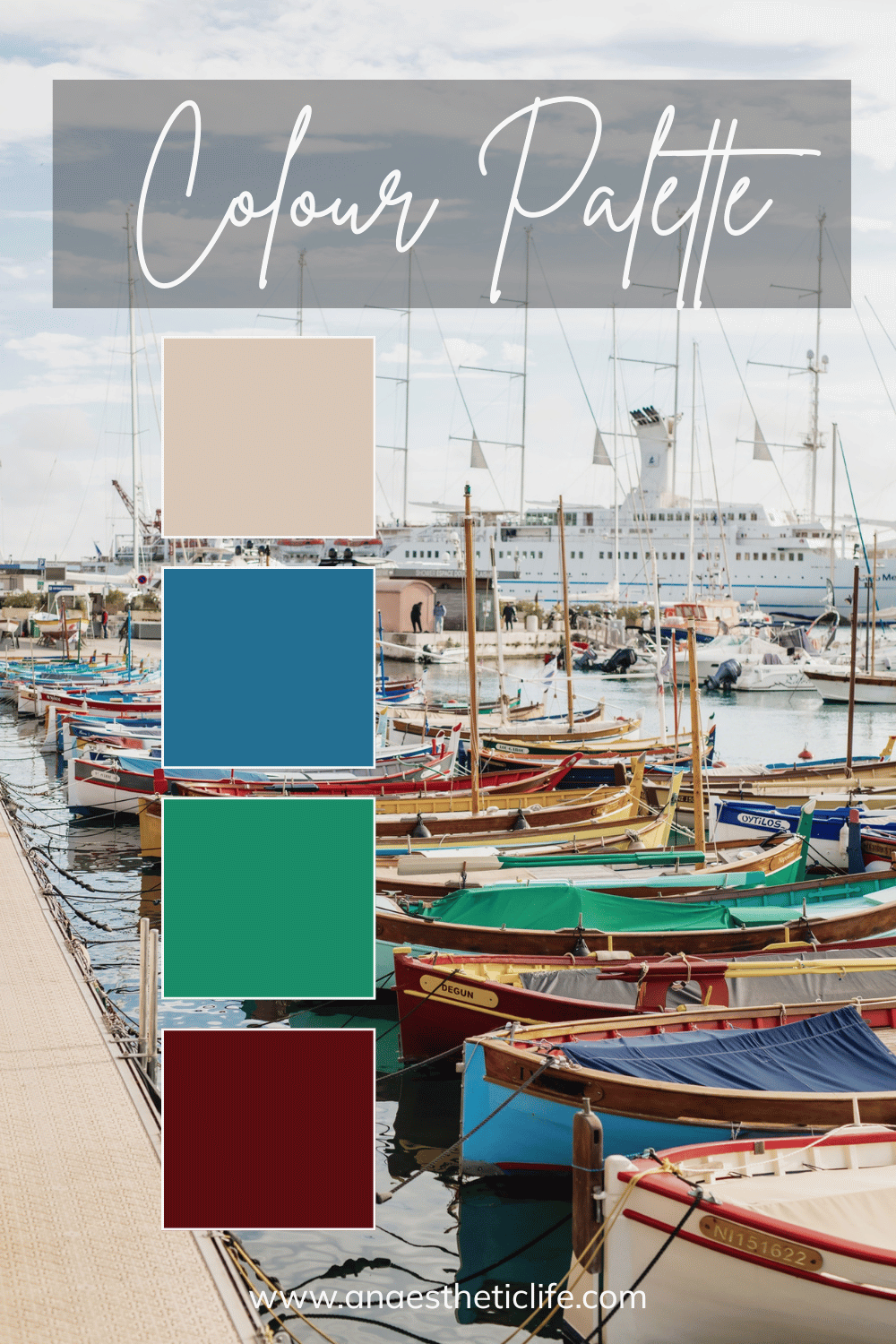
Bold Green and Blue
This color palette is inspired by the French Rivera and the boats that live there. I love the bold colors combined with the more neutral cream. This would be great for a room in your home that you think needs a little more character – go big with one color and then add on the others in small ways.
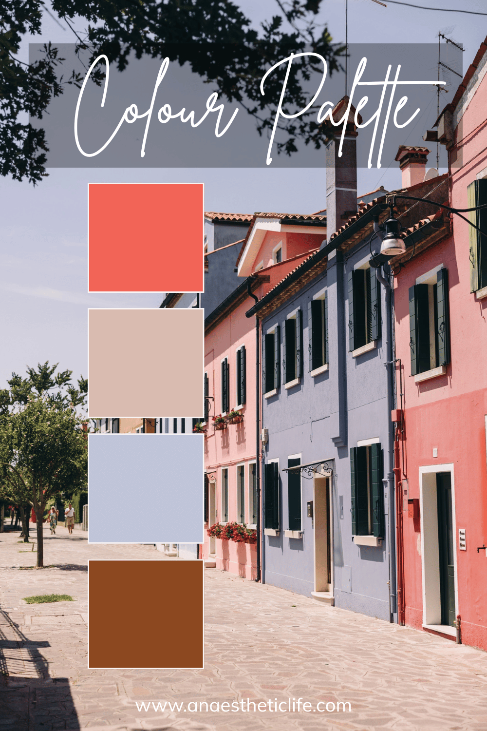
Pastel Pink and Blue
This color palette comes from home in Italy, and it’s more pastel while still having tons of color. Not to mention, it goes into more neutral colors in it as well, which means it’s a bit more reserved than the last palette. This can be a great way to bring a fun, feminine vibe into your home or wardrobe or wherever these colors feel good to you for.
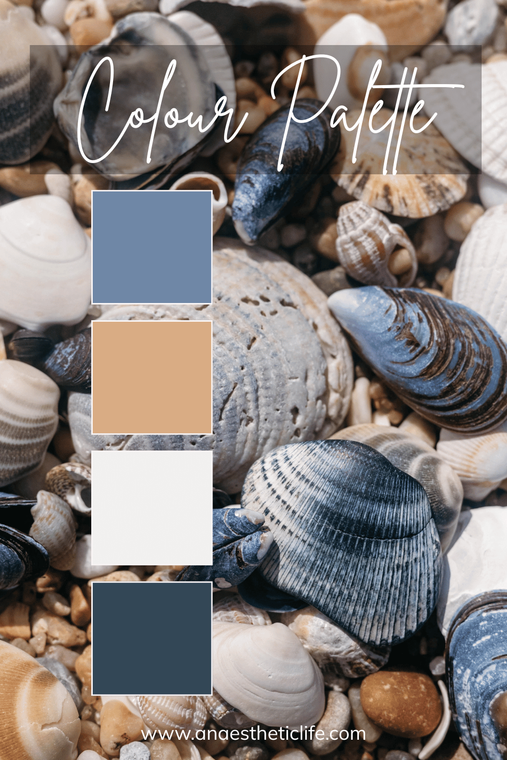
Blue Coastal Vibe
I absolutely love this color palette, which comes from a beach trip. The shells provide those nice blues while still adding in that tan and cream color. If you’ve got a home that you think needs more of a coastal aesthetic, then these are the colors you can start incorporating!
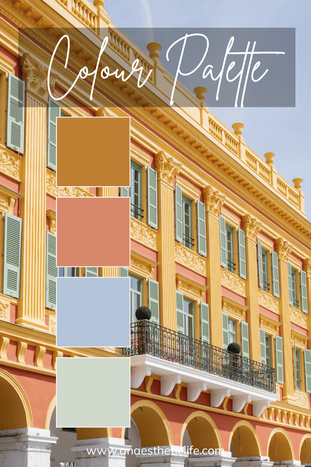
Simple but Colorful
This color palette is another one inspired by the French Rivera, and it’s just as colorful while being slightly more muted. You can really take advantage of the different blue, green, and yellow while getting a hint of pink as well. This one is so much fun and can provide so much inspiration depending on what you’re looking for.
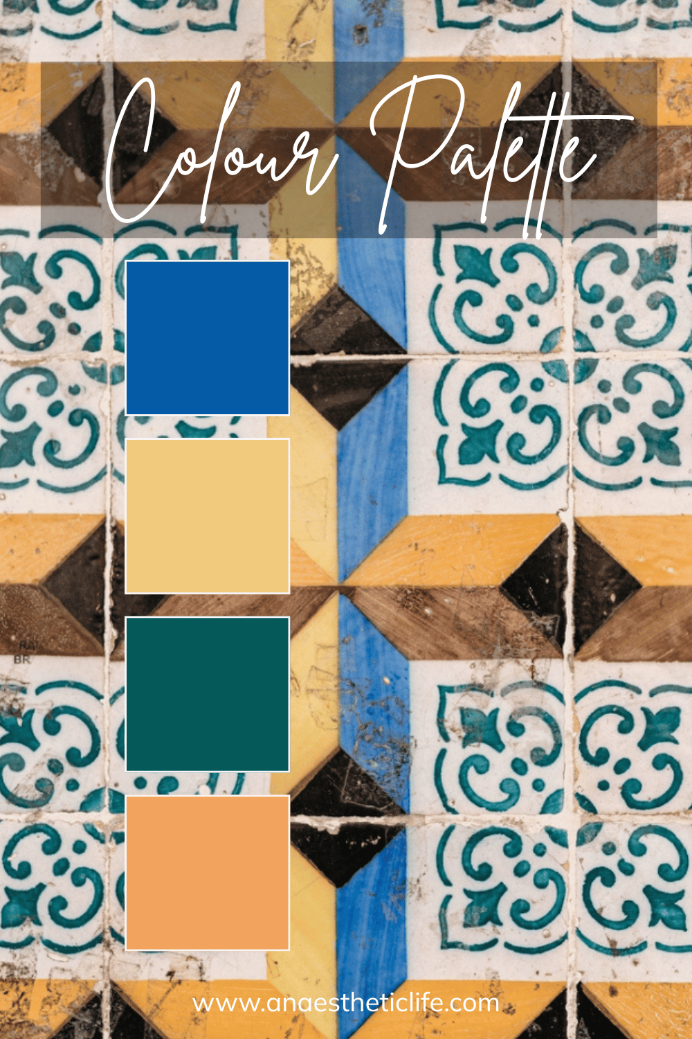
Bold Colors from Portugal
I love this color palette inspired by the tiles of Portugal. Portugal is such a gorgeous country, full of old, decorative moments like this one. These colors can make you feel like you’re adding really charm and history to your space. If you’re looking for a more unique color palette with tons of potential, this one is for you.
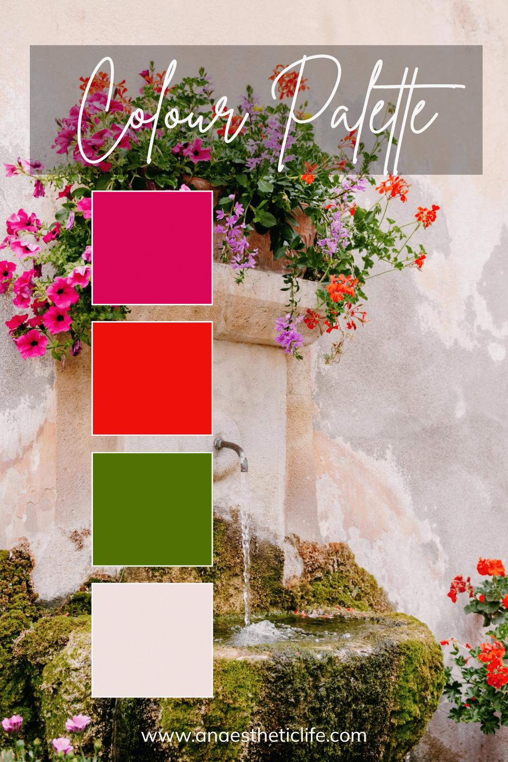
Pink Floral Overload
This color palette comes from the floral scene on the Mediterrian coast, and it’s got explosive pinks and a dark green. Add in that more neutral, creamy white, and you’ve got a color palette that’s functional and full of personality. This color scheme is clearly for the bold, and I love it for that reason.
The right color palette can inspire you, even if you don’t take the entire thing or quite frankly, only start with one color you love. Any of these color palettes would add fun and charm to your life, but you can always take or leave what you don’t love. But we love pulling colors from photos because it’s a great way to see how they all visually work together. That’s the benefit of getting your colors straight from the world.
How would you use any of these color palettes?